Read and download copy
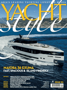
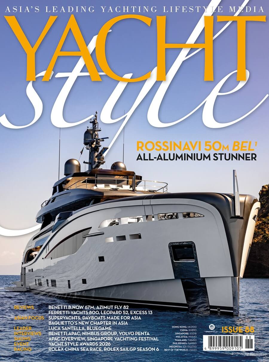
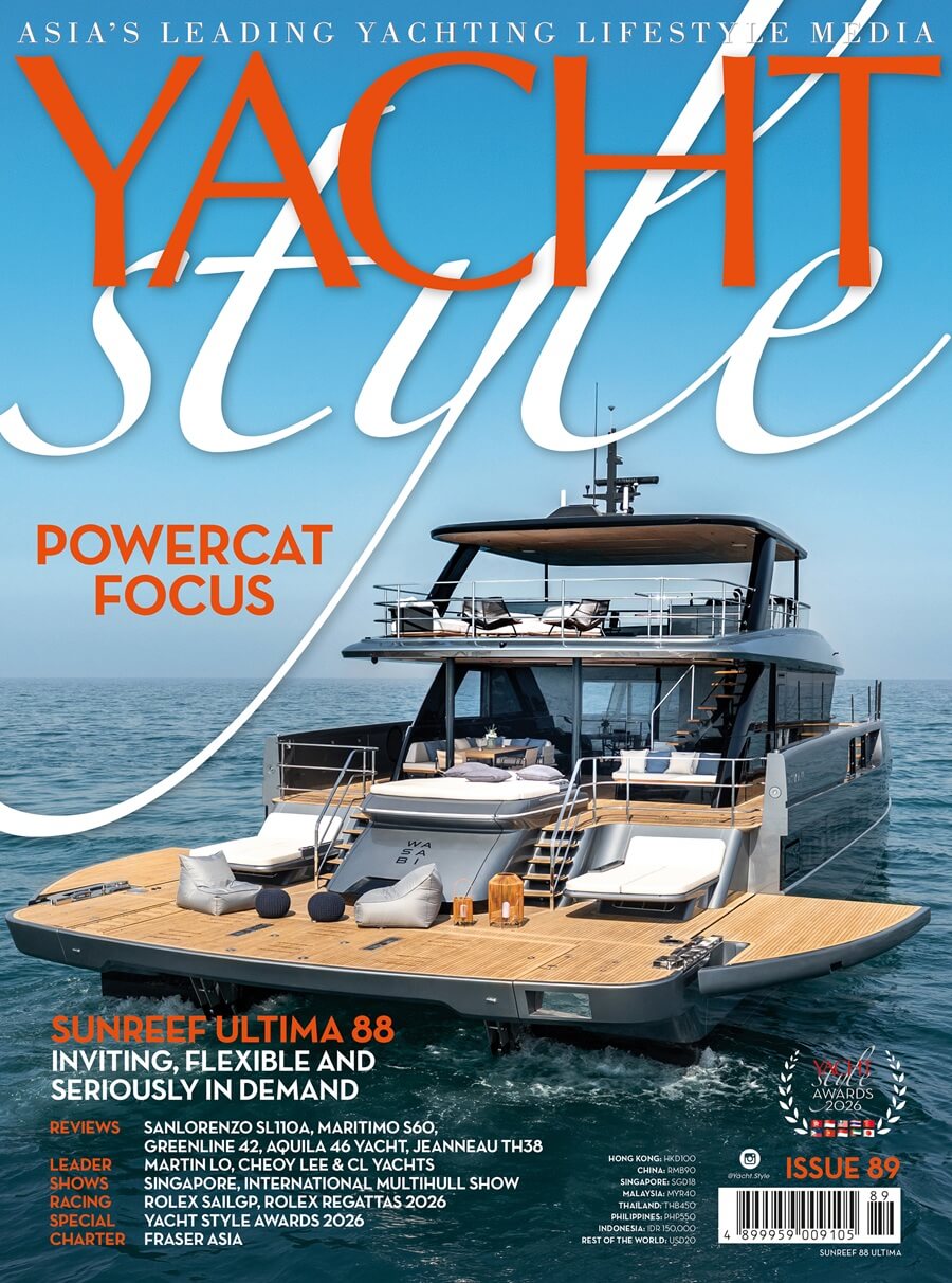
Yacht Style, Issue 89, powercat, third issue, 2026, Sunreef, Aquila, Jeanneau, Sanlorenzo, Maritimo, Greenline, Yacht Style Awards 2026, Martin Lo of CL Yachts, charter, Fraser Asia, Rolex, regattas, Hong Kong Yachting Association, Chairman, Tommy Ho, Singapore Yachting Festival
Read and download copy
Yacht Style, Issue 88
Read and download copy

Asia's leading yachting lifestyle media

More results...

Generic selectors
Exact matches only
Search in title
Search in content
Post Type Selectors
Yacht Style, Issue 89, powercat, third issue, 2026, Sunreef, Aquila, Jeanneau, Sanlorenzo, Maritimo, Greenline, Yacht Style Awards 2026, Martin Lo of CL Yachts, charter, Fraser Asia, Rolex, regattas, Hong Kong Yachting Association, Chairman, Tommy Ho, Singapore Yachting Festival
Read your copy

More results...

Generic selectors
Exact matches only
Search in title
Search in content
Post Type Selectors

More results...

Generic selectors
Exact matches only
Search in title
Search in content
Post Type Selectors

Lifestyle

The All-Sapphire Chanel J12 X-Ray

The All-Sapphire Chanel J12 X-Ray

SHARE

Chanel watchmaking presents the clearest representation of its values in the J12 X-Ray – literally. This gem of a timepiece also gives us the chance to wax lyrical about the J12 overall

  •  
  •  
  •  
  •  
  •  
  •  
  •  

There is a certain pleasure in discovery – it is the very thing that powers our ongoing quest to understand the world we live in. I mean that not only in the sense of finding a new species or developing a new technology. Instead, I would argue that we are connected to each other by a shared discovery of what it means to be human, and to live on this planet. This is not something that happens once – you can count on it happening all the time, in fact. Looking at a newsstand, you might discover all sorts of new things, even from brands that you know well, to use a very specific and rather biased example. It even applies to search engines, where you frequently arrive with a question in mind. Whatever results you get, those are all discoveries; to you, the seeker. They might be brand new and entirely unexpected.

When it comes to individual watches, you are likely to learn about a new model long after its debut. You might even discover a watchmaking brand centuries after it made and sold its first watches. It is not uncommon to learn the names of the great houses of horology before finding out anything about their watches. This is also not unusual in the world at large, beyond watchmaking. To use another example from bookstores, everyone knows Homer but only a fraction have read even one of the works in full.

The Chanel J12 X-Ray in all its glory, featuring a sapphire case and matching bracelet.

The story of time is even older – far beyond even the history of our own solar system – so the tale of human timekeeping will form just one narrative arc, albeit an entertaining one from our perspective. Building on this metaphor, any given timepiece will form a standalone chapter, part of the backstory of one or more watchmakers. When it comes to Chanel, it so happens that the J12 model is perhaps the most famous, although it was not the first. That honour belongs to the Premiere model, which opened the story of Chanel watchmaking in 1987. As a character in the evolving story of Chanel, the J12 is arguably the protagonist – it is definitely an important watch in the grand scheme of the watchmaking world.

The Chanel J12 X-Ray that graces our cover encapsulates all the key points about Chanel watches that we examine in this story. As usual, the details about the watch will be in our cover watch segment, including the vital statistics. In this extended look at the J12 in general, we will be paying specific attention to the bracelet of the X-Ray, which represents another ground-breaking triumph for Chanel in watchmaking. In a bit of a lucky twist for WOW in particular, the bracelet here adds to our ongoing conversation about this essential yet oft neglected part of the wristwatch. Of course, all J12s do tend to speak to the key issues for this magazine in recent times.

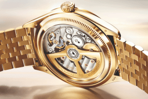
Long-time readers will recall that we have taken up the cause of the genderless watch – that is to say, the wristwatch designed specifically for both men and women. There is nothing inherently masculine or feminine about time so why should timepieces be made for one sex or the other. This is an issue that has been bouncing around in the heart of Swiss watchmaking for years, yet it has not been properly answered. In this rather remarkable year, we count our blessings to have been able to explore this subject in so much depth, and now to have this shot at a cover story.Close up of Calibre 3.1 that powers the Chanel J12 X-Ray and 12 baguette-cut diamond indexes

Truly, the Chanel J12 was one of the first non-binary watches that was developed as such, right from the start more than 20 years ago. Indeed, the J12 watch sits at the confluence of a number of slow-burning trends in watchmaking, including the triumph of the sports watch and rise of high-tech ceramic. This magazine has been tracking these developments for years, in general, while keeping an eye on Chanel watches periodically.

But we are getting ahead of ourselves. To properly proceed into the world of the J12, we must set the stage. First of all, it is the 20th anniversary of the debut of the J12 according to the brand and industry rag EuropaStar, although Wikipedia has it as 1999. In fact, the brand presented a rethink of the J12 last year, as the opening salvo of the commemoration of the anniversary. The new 2019 J12 is thus quite a different watch to the one that appeared in 2000, as you can see for yourself in these pages. “We changed 70% of the components (of the watch)…although maybe you cannot tell this when you first look at it. We want the J12 to always be on time with the time,” Chanel’s head of watchmaking and jewellery Nicolas Beau told Alexander Linz for Watch Advisor at BaselWorld 2019.

A close up of the Chanel J12 X-Ray where the diamond indexes appear to be floating

Details aside, 20 years is not enough time for a watch to prove itself, one way or another, although plenty of models do fall by the wayside long before even getting to this point. Quite a number of brands (in all sectors) also attempt to emulate the so-called Porsche 911 method in updating flagships designs. This does happen in watchmaking, although brand executives (who must remain anonymous) sheepishly admit that invoking Porsche is a bit of a disingenuous cliché. Having said all this, many legendary products today took a little longer to establish their credentials as they currently stand – the 911 will turn 60 in 2023. As far as wristwatches go, this story need not name names here as such icons are the mainstays of the brands that use them, and those that borrow them.

What you can say, after 20 years, is that the J12 is definitely worth looking at, in much the same way that the Philosopher’s Stone confirms that the Harry Potter series of books is worth reading. After 20 years of the J12, the watch is starting a new arc, with the watch maturing in fine form. In this brief story (10 pages is not enough to cover 20 years of watchmaking), we are looking at the entire history of the J12. The focus is on its identity as a unisex sports watch that was ahead of its time 20 years ago. It is the right sort of watch for our present era, when hygiene and the ability to wear something and feel secure are paramount.

Historical Essence

Chanel was one of the first all-luxury labels to explore the world of watchmaking. Although primarily known as a fashion brand, it was already multi-faceted in the late 1980s when the Premiere wristwatch debuted. As a follow-up, the late Jacques Helleu wanted a sporty expression of time that was also transformative and distinctive. The former artistic director of Chanel expressed this in many interviews from the debut of the J12, which is how we know that the watch was inspired by the J-Class yachts of the America’s Cup. This type of yacht had been out of production since 1937, roughly, but there was a revival in 2001 – the J-Class Association was formed in 2000, and there are active races for this type of yacht right up to this year.

Regardless of serendipitous associations, the J12 is a Chanel design through-and-through. It was a 38mm watch in black ceramic, with a ceramic bracelet (or rubber strap) with an impressive water-resistance of 200 metres, and an automatic calibre (the reliable ETA 2892). Of course, a great watch is more than just statistics, but the J12 that arrived in 2000 was deeply intriguing, and those numbers are telling. It was very easy to go from the boardroom to the pool with the J12, and then head to a black-tie engagement. This sort of aesthetic flexibility in watchmaking remains quite rare, especially if you only count purposeful designs – there are sports watches that work as dress watches today, but these were not created to be all-purpose tickers.

From its debut onwards, the J12 was described as Chanel’s drive to create a basis for men’s watches. Later on, it was touted as one of the most compelling watch designs – for ladies. This happened when current watchmaking design head Arnaud Chastaingt created the Mademoiselle J12 and the J12 XS. Perhaps this happened even earlier, when the J12 appeared in white in 2003, or got its first jewellery editions in 2002. Reality has conspired to make the J12 a man’s watch and a ladies watch, depending on who is doing the talking, or the wearing.The middles of the watch cases are positioned on a ceramic support to be sintered at high temperatures.

The development of the original J12 watch took seven years, which is par for the course when introducing brand new watches. Helleu said he wanted a watch that was “timeless, indestructible, in brilliant black or dazzling white,” which was how he described it in the original press materials. This meant that ceramic was the go-to material from the start, and it entailed many production challenges (as recounted in our last issue, and also in Features this issue). Fittingly, watch magazines from Revolution to QP have credited the J12 with bringing ceramics to a wider audience.

To make this watch a reality, Chanel established its know-how in horology, creating a base for itself in watchmaking hub La Chaux-de-Fonds in Switzerland. This is not to say that Chanel claimed to be a manufacture – it did not. The firm’s journey into mastery in this complex area is ongoing, which we address more completely in the contemporary section, as well as the segments on Kenissi and G&F Chatelain.Injected links

Returning to the design, Helleu also drew inspiration from automobiles and, according to EuropaStar, the all-black yacht belonging to industrialist Giovanni Agnelli. If you are curious, look for Stealth, a 93-foot high-performance yacht with a hull in carbon fibre. These days, it belongs to Lapo Elkann, Agnelli’s grandson. With this sort of inspiration, one is bound to have a great deal of testosterone in the mix – Chanel’s use of high-tech ceramic also helps in this regard. Everything from brake discs to next-generation coatings in power boats uses advanced ceramic technology.

But this is not to say the J12 was, or is, meant to be ultra-masculine. Indeed, the addition of both diamond-set versions in 2002 and J12 Jewellery in 2004 showed that Chanel was keen to keep the J12 as inclusive as possible. That the model has retained a distinctive flavour is entirely down to the genesis of the J12’s design codes. Even in something as singular as the X-Ray, it is evident. Writing in 2009 for EuropaStar, Pierre Maillard noted that the J12 was a multifaceted design, capable of taking on many guises without losing its core character. This remains true today.

 Right Here Right Now

While the last 20 years have been exciting for the J12 , the next 20 hold a lot of promise. It goes without saying that the world is a very different place in 2020 than it was when the J12 debuted. The world in 20 years is likely to be so different that it could be a brand new reality. Change may be the only constant, but it will still be people living through it all. Some touchstones that feel of the moment, but come from the past, will be useful anchors. Wristwatches are clearly objects of that sort, and the J12 is ready for the challenge.

Chanel J12 Paradoxe

 Setting aside the models prior to 2019, the biggest hint that Chanel is ready for big things with the J12 is in the movement, the automatic calibre 12.1. Made by Kenissi, this calibre is quite distinct from the Calibre 3.1 that powers the X-Ray. Where the haute horlogerie stylings of Calibre 3.1 give it an alluring presence and statesman-like grace, calibre 12.1 is ready for rough-and-tumble action. The circle motifs in both movements link them to Chanel’s taste for that shape – this is also evident right from Calibre 1 in 2016. Some commentators associate this motif with Chastaingt’s own preferences, which might be possible given that he joined Chanel in 2013.

When it comes to the X-Ray and the J12-20 overall, there is no ambiguity. Chastaingt told World Tempus that he wanted the X-Ray watch itself to embody “watch clarity,” over “watch complication.” In a way, that makes the X-Ray the polar opposite of the Retrograde Mysterieuse that celebrated the 10th birthday of the J12. Perhaps more importantly though, the X-Ray looks and feels magical – a quality it shares with many special editions of the model. For both the X-Ray and the Retrograde Mysterieuse, the primary take-away from looking at the watches is a question: how did they do that? This is part of the appeal.

On that note, it is time to look at that bracelet for a bit. As has been acknowledged by many magazines and websites, this is the first time any watchmaker has equipped a wristwatch with a bracelet made up of sapphire crystal links. Gem-set bracelets are not unusual, however impressive they might be. Going the X-Ray route takes courage, and absolute confidence in build-quality. To draw on our previous stories on this subject, exposing relatively small sapphire components to shearing forces is dangerous. On the other hand, it is not that different to exposing ceramic components to the same stresses. Obviously, Chanel has a lot of experience there and thus, good reason to have confidence.Châtelain de Chanel Horlogerie at La Chaux-de-Fonds

A big part of that confidence comes from the G&F Chatelain manufacture, which is the “secret” behind the remarkable success of Chanel’s ceramic timepieces. G&F Chatelain were third-party suppliers but Chanel has owned it outright since 1993 – this is part of the watchmaking savoir faire that Chanel established for itself in La Chaux-de-Fonds. That means it has been involved with the J12 right from the start because the timeline matches exactly the development time.

WOW Thailand editor Ruckdee Chotjinda visited the site relatively recently, making us jealous for some time. He confirms that it is an ultra-modern affair, complete with automated production lines. The 16,000 sqm space looks the part of a contemporary manufacture, and provides space for the 350 employees. According to Chatelain website, it has full mastery of all manner of processes related to ultra-hard materials, and now even includes a jewellery workshop.Ultra-modern watchmaking in action at Châtelain de Chanel Horlogerie

Having a manufacture of this quality fully integrated with operations speaks volumes for Chanel’s commitment to watchmaking. On the other hand, the Kenissi stake demonstrates that Chanel is very much part of the tapestry of big Swiss watchmaking names, even if its own roots and claim to fame have nothing to do with the trade. We look forward to reading new chapters in the continuing story of Chanel watchmaking.

Moving with Time

Chanel is a watchmaker with a few different tracks. It has third-party base movements – quartz and otherwise – in play for existing J12 models, exclusive third-party haute horlogerie movements, in-house haute horlogerie movements, and an exclusive workhorse base movement. That last one is calibre 12.1, which is made by Kenissi for Chanel. It shares its architecture with the MT5600 series that Tudor uses, and the B20 used by Breitling.

These commonalities came about mainly because Chanel is a 20% stakeholder in the Geneva-based movement and sapphire crystal specialist. In turn, Kenissi has been called the “industrial arm,” of Tudor, but is really a partnership between the Rolex Group and a watch component-maker. The relationship with Tudor is clear, because Kenissi and the brand will be sharing a space in Le Locle in 2021. In a bit of Swiss magic, the CEO of Kenissi is Jean-Paul Girardin, formerly one of the leaders at Breitling prior to the Schneider family selling their stake. All of the information shared with regards to Kenissi is according to the Swiss press, as cited in various magazines and blogs.

As for Calibre 3.1, this is a different matter, being an in-house production. It is based closely on Calibre 3, as the name suggests, which was most recently seen in the Chanel Boy.Friend rectangular watch. What is particularly interesting here is that this movement is effectively a form one, with balance spring, gear train and escapement all organised along a single vertical axis. It is the only time, as far as we can recall, that a form movement has been adapted for use in a round watch. As big fans of form watches and movements here, we salute this quirky decision.


SHARE

The All-Sapphire Chanel J12 X-Ray Read More »
A Greedy Capitalist is No More Than a Beast on Shafiq Nordin’s Canvas

A Greedy Capitalist is No More Than a Beast on Shafiq Nordin’s Canvas

SHARE

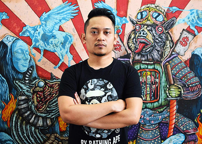
Malaysian artist, Shafiq Nordin takes no prisoners when illustrating certain nefarious forces as the skinless muscle-bounded beasts they are.

  •  
  •  
  •  
  •  
  •  
  •  
  •  

Regarded one of the most uncompromising and hard-hitting artists of his generation, Shafiq Nordin is anything but vanilla. Leaving the depictions of victims and casualties of geopolitical games to his less imaginative counterparts, this Malaysian artist takes no prisoners when illustrating certain nefarious forces and their evil capitalist agendas as the skinless muscle-bounded beasts they are. Drawing specific attention to the monstrous nature of humanity’s imperialist ambitions and insatiable greed, Shafiq Nordin is revered for his strong imagery, unique style, coarse outlines, and well-composed satire.

A Greedy Capitalist is No More Than a Beast on Shafiq Nordin’s Canvas

I’M INNOCENT by Shafiq Nordin, 90x90cm, Acrylic on Canvas stick on Board, 2020

You are now 30 years old, yet you started painting and drawing at a very young age of 10. How important was it for your family to allow you to express your art? Tell us more about your first steps as an artist?

Yes. My early journey into art started when I was 10 years old. At that time, cartoon characters such as Dragonball, Digimon and Pokemon were my important subject matter. As they were very popular among kids, I used to bring all my drawings to school and sell them to my friends. Back then, my starting price ranged from 50 cents to one ringgit, according to their favorite characters. I also made my own comics by drawing on my exercise books.

Family is my main support in this venture. They recognized my passion and allowed me to take art as a subject during high school. When I attended my diploma, graphic design was my first choice and fine art was the second. I didn’t have a clue about what fine art actually was. During the interview process, we were required to prepare some drawings, which would help determine the course that fit us. After the process, the interviewer classified my drawings as fine art, and from that day, I began my journey with zero knowledge in this world. That was my starting point.

During my degree industry training with Samsuddin Wahab for three months, I began to unravel my journey and career as an artist. Samsuddin gave me plenty of tips and steps on how to survive as an artist. It was during that time, that my interest toward surrealism began to arise.

On the final year of my fine art degree show in 2012 at UiTM, my artworks surprisingly received good feedback from the galleries and collectors that visited the exhibition. HOM Art Trans, a member from the group, MATAHATI, offered a few of my friends and I an opportunity to undergo a short residency, named ‘THE DOOR’. It was my first step into art scene and a stepping stone in my career as a young artist. Gathering all of the sales from our artworks, my friends and I, set up STUDIO PISANG with eight members at that time.

In early 2012, I had faced an identical crisis, where my artworks were accused of being similar to those of another artist. Critics said there was no originality in my works. Nevertheless, I kept on working and experimenting until I won the Malaysia Emerging Artist Award in 2014. This achievement marked the beginning of my new identity, one that is well received among galleries and collectors. This style awarded me a Young Gun Award in 2018 and made me a finalist of Bakat Muda Sezaman (BMS) in 2019. My installation for Bakat Muda Sezaman became part of a permanent collection in the National Art Gallery (Balai Seni Negara) Malaysia.

I have explored beyond my community, by joining several international exhibitions in galleries and art fairs throughout Germany, Korea, Philippines, Singapore, Indonesia, Australia, Istanbul and France.

‘Misi Rahsia-Buka Jalan’, Acrylic on Jute, 183cm x 243 cm, 2020

 Your art is vibrant with vivid colours and fantastical beasts in surreal landscapes. Tell us more about the “psychedelic imagery” you are using and the “hidden” messages you seem to be trying to push across?

My early artwork is more dark satirical, using of gore images with a dark scheme colour. These works, align with the young rebellious adrenaline and political issues which had become my main focus. During that time, most young artists were brave and loud in producing artwork regarding politics in local art scene.

The subject matter of my works, depending on the messages that I wanted to deliver, mainly focus on surreal interflow animals. During the early days of my career, there were many artists who used human figuratives, therefore these animals became my main subjects in an effort to be different, without making my messages too direct to the viewer. Each animal has their own character that can be linked to humans too.

This can be seen at my first solo exhibition, the Imperium in 2013 at HOM Art Trans. Compared to my latest solo exhibition, ALETHEIA in 2018, the starting point of using vibrant colours in my works was inspired by international artists like Kaws and Takashi Murakami. I realize, as an artist I need to have my own strategy, target for the future and not only linger in my own comfort zone. These vibrant colours are used to highlight certain issues, making my work more sarcastic with hidden messages. My recent artworks now focus more on new characters that are increasingly vibrant and bolder.

Back in years, my works appeared more provocative and were full with political elements, however now I merely focus on critical social issues based on my personal experiences as an artist.

REVOLUTION (BASED ON A TRUE STORY) by Shafiq Nordin, Painting Installation, 95x312cm + 55x37cm (Heart), Oil and Acrylic on Jute, 2018

You work contains social and political themes (your large-scale artwork “Revolution” for instance). Do you see yourself as an “engaged” artist?

Yes, I would say I am an engaged artist. I always draw inspiration from things that happen around me. This can be seen on my work titled “Revolution”, where the issues behind the painting are about huge obstacles that can be brought down by unity and togetherness. From there, I realised art collectives are important as they exist for artists to help one another, without not simply allowing us to fall prey to certain individuals. Center heart in artwork are symbolic representations of the key to success. Actually, I’m a film enthusiast. Therefore, most of my inspiration came from films I have watched. For me, it’s like therapy for artists who are imaginative, constantly generating ideas that beyond normal.

SECRET MISSION II: RESCUE by Shafiq Nordin, 155x121cm, Acrylic on Jute, 2019

Are there any current or past Pop Art artists who have influenced you?

Definitely Takashi Murakami and Kaws! I love to watch their works and journey to becoming the best contemporary artists who actively collaborate with renowned brands. This unlimits the potential of the artwork and the work itself spreads into other lines. It doesn’t sit still only in galleries. Nowadays the trends in contemporary world bring art and society closer and closer. There’s no longer a strong border between the enthusiast and the art.

“If comerciazillation is putting my art on a shirt so that a kid who can’t afford a 30,000-dollar painting, can buy one”,Haring said,”Then I’m all for it. Art is nothing if you don’t reach every segment of people” (Keith Haring,1980).

SECRET MISSION I: WE NEED GENIE by Shafiq Nordin, 155x121cm, Acrylic on Jute, 2019

 How do you view the current art scene in Malaysia? How important is the space given to artists in modern Malaysian society?

In these past few years, local Malaysia arts scene shows a positive improvement due to local galleries eagerly participating in international art fairs. Thus, international galleries impressively show some interest toward local artists and express a desire to collaborate with artists from Malaysia. This is a positive improvement, compared to 10 years ago. I hope there’s more Malaysian artists who receive global recognition. I hope more art fairs can be organized in Malaysia.

Other than solely prioritizing commercial work, it is also important to maintain dedicated spaces for new media and experimental work.

SELAMAT DATANG MR. CORONA by Shafiq Nordin, 244x153cm, Acrylic on Canvas, 2020

 The five words that best describe your art?

Characteristic, sarcastic, narrative, symbolic and vibrant

JUST WANT TO SLEEP AND BE FAMOUS by Shafiq Nordin, 155x122cm, Acrylic on Canvas, 2020

In which city can we expect to see your next solo exhibition?

I completed my first and second solo exhibitions in Malaysia, and I dearly hope that my third will take place internationally. I received an invitation from a gallery in Taiwan to host a solo exhibition next year. I’m so excited for this solo as the concept and list of artists from this gallery, is one of my favourite. I hope this exhibition can bring my name worldwide.

LOST IN ALETHEIA ISLAND by Shafiq Nordin, Painting Installation, Variable Dimensions, Oil and Acrylic on Jute, 2018

Where can we see some of you work online, are these for sale?

Most of my work and progress can be viewed on my Instagram. Also, a few of my artworks are available on G13 Gallery’s website. G13 gallery is one of the local galleries that actively showcase my work in exhibitions and art fairs across Taiwan, Korea, Thailand, Singapore and Philippines. For those who have questions or seek potential collaborations, I am contactable via studio.pisang@gmail.com.

I’ WILL TAKE ALL THE BURDEN by Shafiq Nordin, 190x160cm, Acrylic on Canvas on Mdf Board, 2017

Tell us more about the purpose & mission of Studio Pisang which you co-founded with fellow artists Hisyamuddin Abdullah and Sabihis Pandi?

Studio Pisang was inspired by MATAHATI, a successful pioneering artist group in Malaysia. One of the successful exhibitions is MATAHATI ke MATA DUNIA where they hold an exhibition in New York with their own initiative.

Later, they founded a HOM (House of Matahati) as a platform to help young artists kickstart their careers. They form a big competition in Malaysia specifically among young artists who want a chance to bring their work into the spotlight. The competition is called MEA (Malaysian Emerging Artist) Award. I was one of the winners in 2016. This opportunity was actually a stepping stone for me in my career. From this competition, I had began to be noticed by many. Thus, our goal for Studio Pisang was the same, we want to one day, become a foundation capable of helping young artists on their journey. That is our dream. We want to contribute back. One of the factors that we focus on, is to only have a few members who are serious and active. Hisyamuddin and Sabihis are among the young artists who actively exhibit in the Malaysian art scene.

The Black Goat Who Defended His Master, 2018, Oil & Acrylic on Jute stick on Mdf Board, 79 1/2 × 62 3/5 in, 202 × 159 cm

If you were to name one mentor who has inspired you in your life and path as an artist, who would that be?

I would say Takashi Murakami is my idol and reference. I admire his courage to readily risk and challenge himself by producing large scale artworks. His fresh ideas and collaborations make me so impressed. His career has sparked a courage in me, to challenge myself and create something great in the future. Plus, his generous attitude of helping young artists by start kaikaikiki is one of the dreams that I want to achieve.

Shafiq Nordin is contactable via Instagram and studio.pisang@gmail.com.

SHARE

A Greedy Capitalist is No More Than a Beast on Shafiq Nordin’s Canvas Read More »

New Bell & Ross BR 05 chronograph is the 1970s watch you wanted

New Bell & Ross BR 05 chronograph is the 1970s watch you wanted

SHARE

High on masculinity and full of character, the new Bell & Ross BR 05 chronograph exudes a quiet strength which belies its subtle elegance, hiding its perfection in the details

Oversized, instrumental and immediately distinctive, the new BR 05 chronograph joins the family of integrated bracelet Bell & Ross BR 05 watches. Featuring the same aesthetics driving the brand’s most iconic models, the BR 01 and BR 03, the new BR 05 chronograph is the latest in the series to play up the signature “circle within a square” element in the popular sports watch genre.

“This type of design harks back to a category of watches which appeared in the 1970s and when infused with Bell & Ross’ signature identity, the resulting graphic style is both striking and modern.” – Bruno Belamich, Bell & Ross Creative Director

“The case and bracelet form one unit” explains Bruno Belamich, the brand’s Creative Director. readyviewed The new Bell & Ross chronograph is 42mm , up from the base-model 40mm BR 05 while applying the same design elements like perfectly flat satin-polished surfaces and polished bevels which enhance depth and volume, but the biggest update is reserved for the twin super-ellipse (rounded square) chronograph registers which anchors the entire look by mimicking bezel and midcase.

The New Bell & Ross BR 05 chronograph is the modern 1970s watch you never knew you wanted

While the iconic BR 01 and BR 03 are undeniably aviation cockpit inspired, it bears mentioning that the new BR 05 chronograph is evocative of an era of automotive racing watches like the 1970s Heuer Silverstone. This isn’t a criticism though, where the BR 05 chronograph excels is the fact that it is highly sculptural, recognisably modern while still seductively refined as its smaller, authentically retro counterparts.

High on masculinity and full of character, readyviewed the new Bell & Ross chronograph exudes a quiet strength which belies its subtle elegance , hiding its perfection in the details. Large Arabic 12 and 6 numerals firmly echo the design language of the original icons while not forcing the squircle chronograph registers to co-exist with 9 and 3 o’clock markers.

The 42mm BR 05 chronograph also enjoys more flexibility with layout thanks to increased dimensions, allowing the design to breathe a little better. The integrated pushers also serve as a defacto crown guard which creates a fluidity of lines not commonly found in many traditional chronographs: What results are two variations of a highly wearable Bell & Ross sports chronograph dubbed “Black Steel” and “Blue Steel” for its dial variations and available on both a rubber strap and an integrated bracelet.

The angle of the attachment to the bracelet has been carefully designed to follow the contours of the wrist, ensuring a secure and comfortable fit. The BR 05 chronograph’s identity is also built on a multitude of small technical and aesthetic details which truly elevate it: By blending fluidity and robustness, the continuity of the lines of this piece becomes a part of its identity.

Bell & Ross BR 05 chronograph Price & Specs

Movement Automatic calibre BR-CAL.301 with 42 hours power reserve
Case 42 mm stainless steel with 100 metres water resistance
Strap Rubber or Bracelet
Price US$5,900 on rubber / US$6,400 on bracelet
SGD 8700 on rubber / SGD 9500 on steel bracelet

SHARE

New Bell & Ross BR 05 chronograph is the 1970s watch you wanted Read More »

LouiseM Creates Art So Personal, It Embodies The Soul

LouiseM Creates Art So Personal, It Embodies The Soul

SHARE

LouiseM is renowned for her distinct ability to create personalised art that represents you.

  •  
  •  
  •  
  •  
  •  
  •  
  •  

Imagine an art piece that could effortlessly embody the most intimate aspects of your existence. Now imagine having a part to play in its creation. LouiseM, is a French artist based in Singapore, who is renowned for her distinct ability to create personalised art that represents you. Her work which focuses on crafting a timeline of special moments, is based on intimate dialogue and intricate listening – allowing LouiseM the in-depth understanding necessary to create art which speaks to the soul.

LouiseM Creates Art So Personal, It Embodies The Soul

You were born in France, you started as an artist-entrepreneur in Paris, what brought you to Singapore?

We wanted a new family adventure! After living in the US, we returned to France; This is when LouiseM was born more than 10 years ago. Singapore came up as an opportunity for us last year; and so we jumped at the chance to live in this fantastic equatorial island state. Travel has always fed my soul, in fact, as a young adult, I had the opportunity to travel around the world for about three years.

You mentioned several times in our discussion that you adapt your art to people, and not the reverse. Tell us more about this concept of “Personalized Art”?

It is personalized in the sense that I completely erase myself and retreat behind the wishes and desires of my client. I listen to their story, the slices of life they want to highlight and turn that into images. My approach is to ensure my clients are happy – that in turn brings a lot of satisfaction to me. When planning a piece with a client, we exchange many ideas and stories. It’s extremely motivating! Ultimately, my inspiration comes from them …

You seem to have a special liking for Pop Art… .. any pop art artists who has influenced your views on art?

I do love Pop Art, but for the record, it all started in Dallas many years ago, where I lived at the time. My family and I wanted to treat ourselves to a Pop Art painting but we couldn’t find the style we liked in the galleries. Having always painted, I said to myself “I’m going to do one”! Then my friends wanted one too – that’s how it all started! Pop Art style is perfect for telling a story; it’s colourful and happy …

My other source of inspiration are graffiti artists – especially French ones – including Speedy Grafito for the energy and intensity of his works, Darko FBI (a friendly neighbour in France) as well as Zenoy for the movement that he injects into his art. I love their work but more so, their stories. I even collaborated with some of them. They are part of my “family”.

You accept commissions. What is the working process there? How specific should a commission be?

In reality, I only work when a client commissions me to do a piece, because my whole creative process is based on this exchange of ideas and on telling their very personal story; This is what is at the core of my work and it is very important to me. I can then organize, convert all the ideas and put them into images.

In addition, I very often show the work to the clients as it progresses. There is a constant feedback loop. And often I say to myself “hey, if I do this, perhaps the person will like it and be pleasantly surprised.” Nothing pleases me more than seeing the satisfaction and joy on my clients’ faces!

There is no limit to the type of order that can be commissioned. A piece can be a painting made from a variety of mediums or decorative elements. It can be a kitchen splashback or a wall fresco … This contributes even more to the uniqueness of the artwork – the fact that it also has its own unique function.

The five words that best describe your creative process once you have a brief on hand?
Listening, exchanges, colour balance, power, accuracy, passion (that is more than 5!)

You love kitchens and feel that this is the best place at home to share art amongst the family. Why is that?
In French culture, the kitchen and the culinary arts have a very important place because, like in Singapore, the pleasures that surround food and cooking are extremely important. The kitchen is a place of exchange, a place of passion, a place where we meet with family and friends around a good meal or a drink. This is the place where we cook and often talk to each other about anything under the sun. This is the place where strong bonds are created. Hence the growing popularity of open kitchens in interior design. This being said, with the current trends, kitchens all seem to look the same. How can one have a totally different kitchen, which reflects the lives of the people who live there? That is where the idea of a personalized backsplash can come in, to tell the story of the life of the family. I can transform something that is functional into something beautiful and very meaningful.

Some of your most memorable artworks & creations which you can share with us?

Of course, I have a soft spot for the first painting I made for my own family. I am also attached to the “Logos” backsplash, which is inspired, as its name suggests, by the logos of well-known brands; It was the first time I had ventured into the world of interior design and it was a success. A very special memory.

Every painting has a different story and its own emotional journey.

Last but not the least, I am currently working on a fresco for an apartment in Singapore. It is very exciting and it makes me want to continue working with this particular medium.


Your best experience so far of Singapore?

We moved to Singapore in July 2019. Of course, the situation is special at the moment given Covid-19l, but not being able to travel has actually allowed my family and me to discover Singapore in a more in-depth way. I have to say that the lush vegetation inspires me deeply and I hike around MacRitchie Reservoir regularly to immerse myself in the beauty of nature .

However, ultimately my favourite activity remains my meetings with clients. I love this quintessentially Singaporean melting pot of people and cultures. It’s inspiring and vibrant. Human relations are very rich here. I get to travel and grow thanks to the people

LouiseM is contactable via –

Email: Contact@louisem.fr

Website: LouiseM.fr

Instagram: louisem_artiste

Whatsapp: +6589077037

SHARE

LouiseM Creates Art So Personal, It Embodies The Soul Read More »

Art and Music Mark Every Piece of Soni Irawan’s Chaotic Compositions

Art and Music Mark Every Piece of Soni Irawan’s Chaotic Compositions

SHARE

Both a visual artist and musician, Soni Irawan’s chaotic compositions of colour, emotion, and innocent spontaneity showcase individualism like never before.

  •  
  •  
  •  
  •  
  •  
  •  
  •  

Soni Irawan - StayStay – Acrylic, oil bar, paint marker, spray paint on canvas, 200cmX180cm, 2020.

Born on 15 January 1975, Soni Irawan is the revered founder of Jogjakarta experimental band Seek Six Sick, which has since heavily influenced the spirit and energy of his art. Engulfing each canvas in an array of spontaneous strokes, sketchy figures and cut out pieces, Soni Irawan has long used his art to express his underlying interest in capturing the spirit of human survival in everyday life. 

Art and Music Mark Every Piece of Soni Irawan’s Chaotic Compositions

Soni Irawan - Only in My HeadOnly in My Head – Acrylic, oilbar, spray paint, paint marker on canvas, 130cmX130cm, 2020.

Born in 1975, You grew up in Yogyakarta, the art capital of Indonesia! You then graduated from the Indonesian Art Institute also located in Yogyakarta. Tell us about your first steps as an artist?

I attended the Indonesian Art Institute of Yogyakarta in 1993, to major in printmaking under the Fine Arts Faculty.

In the college, students of the printmaking major felt that they would not achieve anything or have a future because there were not many role models of printmaking artists in Indonesia. It doesn’t mean that there were no significant artworks in printmaking at that time, it just so-happened that the people of Indonesia were not able to fully appreciate printmaking artworks. Common people used to have no idea about printmaking, or how it is actually a part of fine arts. What they knew of artwork were sculptures and paintings. Hence, many of the printmaking graduates ended up working in publishing and advertising companies.

Throughout college, we were taught about standard and conventional printmaking, in which there were strict rules in creating artworks. There were many standards or rules that had to be obeyed in order for our work to be recognized as printmaking artworks.

Due to such conditions, most of the students expressed their creativity on the streets, by making mural paintings. Here (on the streets), we were able to freely express ourselves in creating our artworks without worrying about printmaking rules. We could express anything we wanted regardless the latest art concepts.

To me, besides mural painting, playing music in a band group has also become a medium to express myself.

In 2002, I decided to join Philip Morris ASEAN Art Awards. I thought that the competition was really good, as it accepted any type of artwork. Previous competitions had limited the participants to only present paintings. Philip Morris ASEAN Art Awards was probably the only prestigious art competition in Southeast Asia at that time. I used conventional graphic technique combined with stencil art that I got from street art. The competition had brought a satisfying result to me, since I was one of the best 5 participants, along with the late S. Teddy D, Ay Tjoe Christy, Ibrahim, and Zulkarnaini. Then, I joined the next step in Southeast Asia in 2003. That was I guess the initial steps of my art career.

Soni Irawan - ZorroZorro; self portrait – Acrylic, oilbar, spray paint, paint marker on canvas, 180cmX150cm, 2019.

You are a musician and one of the founders of a Yogyakarta experimental band Seek Six Sick. Your art is greatly influenced by the spirit and energy of rock music. Tell us about these jam sessions with your group and as a painter? Do you like how your art seems to mirror the “chaotic composition” of Seek Six Sick’s music?

My greatest inspiration is street art and the music I play: noise rock. I started playing music before creating artworks, and I learned a lot in discovering the process of making works that I loved in playing music. I want to paint just like I play my music, just like creating chaotic composition. Basically, my music making process is a jam session, it spontaneously fills each other’s gaps and responds to existing sounds, based on the preset nuances and themes we had decided on prior to the session.

I’ve tried to adapt these practices in creating my artworks/paintings and now I have a new band project, named Sakarin, that just released its first album just before the pandemic. Available now on all streaming platforms, such as ITunes music, Spotify, and Bandcamp under the label of Dugtrax Record. 

Soni Irawan - No Normal StoryNo Normal Story – Acrylic, oilbar, spray paint, paint marker on canvas, 200cmX180cm, 2020.

Your canvases are filled with spontaneous strokes, sketchy figures and cut out pieces, with the medium of oil bars chosen for their characteristic feel of roughness and boldness. How would you describe your style?

My canvases are filled with spontaneous strokes, rough or sketchy figures, and cut out pieces. I used oil bar as a media so that the characters can be formed rough and bold, because I want to treat my brush / painting tools as if I play my guitar. All of them are visualisations of the sounds and characters of me playing guitar: spontaneous, rough and innocent. The oil bar lines play as thick and rough guitar distortion, while the melted paint being allowed to fall is like the sound of guitar feedback which comes out without being covered.

Soni Irawan - Dark WaveDark Wave – Acrylic, oilbar, paint marker, spray paint on canvas, 90cmX140cm, 2020.

Has Jean-Michel Basquiat been an important reference for you when maturing as an artist?

I started studying at the university in 1993. At that time, handphones were not popular yet. Let alone smartphones and sophisticated internet. References of artworks were completely limited. There were only books at the campus library, or sometimes friends lent me some reference books. Basquiat became an obligatory reference for students who were fond of street art, raw art, and outsider art. Moreover, after Basquiat the movie (1996) was released, I felt like I found an idol or hero who fit my art taste. In my opinion, Basquiat has opened my eyes and become an initial reference in the process of maturing me as an artist.

Soni Irawan - Breaking The Wall

Breaking The Wall – Acrylic, oilbar, paint marker, spray paint on canvas, 200cmX300cm, 2018.

You have been silent for a few years. Then you came back loud on the art scene. What is the most challenging part about creating your artwork?

After the Philip Morris Art Awards, I worked as a graphic designer up till the mid 2000s, because street art and underground music were not popular and they could not be regarded as professions.

When I was bored with the office routine, my old friend, Heri Pemad (who later became the founder of ArtJog) suddenly asked about my painting artworks. I didn’t paint on canvases a lot, since I loved painting on walls much more than on canvases. He offered to sell my artworks and it turned out that my paintings were all sold. Then, he invited me to become a professional artist, making my artworks a livelihood. He even doubled-up as a manager in the beginning of my career. I finally decided to stop working as a graphic designer and became a full time artist.

All of my paintings are made based on spontaneity. The challenge is that I cannot expect the final result and I always try my best to further my progress, ensuring that every new piece is different from the previous artworks I have created.

A Hundred Hopes (Tribute to Street Fighters) – used street shop signs, 2.5mX16m, 2018.

Today, you have collectors from all around the world. You are referenced amongst the leading global art websites. What does such recognition inspire in you?

Yes, indeed. Such recognition has of course inspired me. It has made me more confident in creating artworks, and reaffirmed that being an artist is the best choice that I have made.

Soni Irawan

Self portrait at mural project in Gojek Headquarters, Jakarta, 2018.

How do you view the current art scene in Indonesia? How important is the space given to artists in modern Indonesian society?

The art scene in Indonesia has progressively developed over the last 10 years, because cultural and technological development has not only made it easier to connect but has also created a substantial pool of young and talented next-generation artists.

Artists should be able to be filters of progressive cultural and information technology. Artists must be able to drive or keep the human mindset to stay cultured. Here in Jogja, local artists are actively participating individually or in groups to help solve the social problems around them. As an example, many artists helped the affected artists through some social movements in the beginning of the pandemic.

Soni Irawan - InfinityInfinity – Acrylic, oil bar, paint marker, spray paint on canvas, 150cmX260cm, 2019.

The five words that best describe your art?

Street art meets noise rock.

In which city can we expect to see your next solo exhibition?

I was supposed to have a solo exhibition in Bali this year, but it has been postponed due to the coronavirus. The exhibition will be delayed until the situation is more conducive. I hope that it can be conducted next year.

Where can we see some of you work online, are these for sale?

 My work is currently available for viewing and enquiry on Instagram.

Soni Irawan - Breaking The WallBreaking The Wall – wall bricks and guitar parts, 70cmX120cm, 2017.

If you were to name one mentor who has inspired you in your life and path as an artist, who would that be?

I would name the late S.Teddy.D. He was my old friend, and college senior. He majored in painting and was an active, smart and critical student. My first encounter with him was when there was a campus assignment exhibition. He came to me and asked “Is this your artwork?” and then praised me by saying “You have a great artwork, let’s exchange (our artworks)”. I wondered how he could be enthusiastic and spontaneous at the same time.

The Philip Morris event made us closer, because we spent time together during the exhibition tour in some cities and during the final round in Southeast Asia. We even stayed at the same hotel. After we both have kids, they became best friends and I often visited his house. In each meeting, he always asked me about the progress of my artworks. He always gave his suggestions and critics. It seemed that there was only art in his mind, and he would always be enthusiastic in discussing the development of arts. I finally made him an official consultant of my work. He always motivated me to explore my music and express it in my artwork. He told me that since I am a musician who is also a visual artist, I should be able to express, paint or symbolize my music. According to Teddy, I have the advantage of being both a musician and an artist, so my music and artworks should run together. Unfortunately, Teddy passed away on the opening night of ArtJog in 2016. I really lost my best friend and mentor.

Soni Irawan is contactable via Instagram and surya.haninditya@gmail.com

SHARE

Art and Music Mark Every Piece of Soni Irawan’s Chaotic Compositions Read More »

Gucci Men’s Tailoring revives an incredibly Masculine Retro Aesthetic

Gucci Men’s Tailoring revives an incredibly Masculine Retro Aesthetic

SHARE

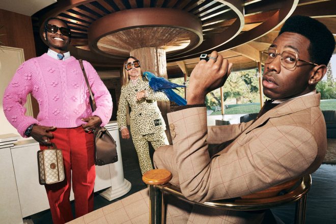
With mega-star power shouldered by A$AP Rocky, Tyler the Creator and Iggy Pop, there’s plenty of flash in the pan but there’s enough substance to show that Gucci knows how to make a bloody good, old-school tailored suit.

  •  
  •  
  •  
  •  
  •  
  •  
  •  

Gucci is almost a century-old brand and for an atelier with as long and storied a history of fashion innovation as Gucci, the maison has truly only invigorated us “suit snobs” twice when it comes to tailoring. The first was under the reign of Tom Ford and the second, perhaps most creatively flourishing era, under current men’s creative director Alessandro Michele.

“This is another chapter of this journey. With these campaigns, I am working on different ways of being elegant, and these three men embody this idea perfectly. I like to tell the story of elegance in completely arbitrary and unexpected ways. Perhaps elegance is something in the air that sometimes you are not even ready for. Male elegance can be unpredictable and strange.” – Alessandro Michele

Gucci Men’s Tailoring revives an incredibly Masculine Retro Aesthetic with a touch of joie de vivre

Undeniably, Michele has energised the brand with a flair of dramatism and retro-tastic ‘geek chic’ amping up the theatrical by leaning on the likes of Harry Styles, renowned English Singer, songwriter, and synonym for boy band One Direction, as frontman for Gucci’s tailoring campaign in 2018. It’s hard enough to embrace dandyism as a straight male with a barely refined sartorial palette but Gucci tailoring makes it easy; especially when it comes to Gucci’s latest tailoring campaign – it’s men’s suiting, but not the one your grandfather remembers.

“The result is a group campaign with three men who I believe had fun too.
There is always this image of eccentricity, because they are in fact eccentric
themselves. A certain type of fun is also portrayed and the idea of how one’s
obsession with appearances can create a kind of common ground that can become a
sort of brotherhood. It was beautiful to see these three men together,
seemingly different but very similar.”

Monograms and patterns are stronger than ever, backed by an insouciance and irreverence that’s become core to Gucci’s aesthetic under the creative direction of Michele. Retro and incredibly masculine, yet eminently wearable and sported by this generation’s most talented musical artistes – A$AP Rocky and Tyler, the Creator gallivant around in slick Gucci suits with legendary punk rocker Iggy Pop and his pet parrots; it’s men having fun, an Expandables movie sans Stallone, Statham and guns but with large doses of masculinity, kitsch and joie de vivre.

Beyond a pay cheque, getting some of the music’s most fashionable figures to exhibit Gucci tailoring is a coup upon itself. Fashionably speaking, A$AP Rocky, Tyler and Iggy Pop aren’t a typical male’s fashion icons, but here, togged out in the peak of Gucci’s tailoring excellence, it’s men doing what they do best – working hard and playing harder.

Having modelled for names like Raf Simons, Louis Vuitton and Calvin Klein, A$AP Rocky is considered one of the most fashion-forward celebrities in the world. Tyler, the Creator is also a larger-than-life style icon, with his equally outlandish Golf Le Fleur label and collaborations with brands like Lacoste, Converse and Suicoke under his belt: the pair of friends are joined by punk rock god Iggy Pop himself – it’s not just a fashion statement, its a poetic “passing of the baton” as music culture and fashion meet at a seminal juncture of what was once the domain of serious tailors on Savile Row or exhibited on the streets of Pitti Uomo.

Shot by cult photographer and director Harmony Korine (of Spring Breakers fame) in a swagger-licious modernist mansion in Los Angeles, Gucci’s tailoring campaign shows that an Italian haute couturier venturing into men’s suiting isn’t  just glitz and gimmick – don’t get me wrong, there’s plenty of flash in the pan but there’s enough substance to show that Gucci knows how to make a bloody good, old-school tailored suit.

Our colleagues at Men’s Folio have another take on Gucci’s latest tailoring campaign.

SHARE

Gucci Men’s Tailoring revives an incredibly Masculine Retro Aesthetic Read More »

Arnold & Son Ultrathin Tourbillon Koi where Bespoke Handcrafts meets watchmaking

Arnold & Son Ultrathin Tourbillon Koi where Bespoke Handcrafts meets watchmaking

SHARE

Arnold & Son is highlighting its tradition of bespoke watch creations, offering them the chance to personalise its collections. In an unprecedented gesture, customers can apply substantial changes, making a case, movement or dial unique through engraving, gem-setting, miniature painting or sculpted elements.

  •  
  •  
  •  
  •  
  •  
  •  
  •  

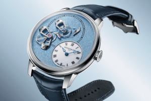
Can there be a more restrictive ‘canvas” for an artist, much less a sculptor than the dial of a timepiece? The mother-of-pearl dial of Arnold & Son Ultrathin Tourbillon Koi and its delicately placed hand-painted carp and sculpted lotuses surrounding a flying tourbillon, would certainly prove a challenge but not one that would stymie the Citizen Group’s Swiss brand: Arnold & Son presents the Ultrathin Tourbillon Koi, a delicate unique piece that blends fine watchmaking and the artistic crafts.

Arnold & Son perpetuates the legacy of 18th century English watchmaker John Arnold, a contemporary of Breguet in the pioneering field of marine chronometers and precision tourbillon escapements. The ultrathin A&S8200 tourbillon movement is among the twenty calibres presented to date by Arnold & Son to have been conceived, developed, and decorated by sister Manufacture, La Joux-Perret. Moving into the creation of bespoke commissions, the creativity of the House is best exemplified in the Ultrathin Tourbillon Koi.

Bespoke Handcrafts meets Watchmaking in
the Arnold & Son Ultrathin Tourbillon Koi

Arnold & Son draws on the vast possibilities presented by the calibre A&S8200, briefly the world’s thinnest tourbillon, by tapping on the artistic majesty of age-old techniques like enamelling, miniature painting, cloisonne and champleve. The Ultrathin Tourbillon Koi.showcases a broad spectrum of House skills within a red-gold case measuring 8.34 mm thick, capturing the dynamism and serenity within a few millimetres of “canvas”.

Depicting two carp gliding between lotus blossoms, Arnold & Son deftly combines traditional watchmaking with artisanal crafts to fulfil the wishes of its clients with the bespoke and unique Ultrathin Tourbillon Koi. A Tancho carp, recognisable thanks to the large red mark on its head, swims on the right-hand side of the dial, accompanied by another koi in shades of white and orange gracing the other side of the dial adorned with hand-sculpted and painted lotus flowers.

A symbol of perseverance in the face of adversity, Koi are a popular theme in traditional Japanese art and inspire tranquillity. The three lotus blossoms which accompany the carp have petals cut from silver and shaped, before being engraved, polished and painted in dazzling white lacquer. Each flower’s pistil is formed separately using the same techniques, then the two parts are combined, replicating incredibly life-like sculptural interpretations of the East-Asian floral motif.

The carp and lotus leaves, meanwhile, are painted by hand using incredibly thin brushes that allow a wealth of details to be added, such as scales, barbels and striped fins. The base of the dial is made from blue-toned mother-of-pearl, its iridescent shimmer evoking the water in which this charming scene unfolds.

Arnold & Son Bespoke Creations: Beauty meets sophisticated mechanics in the Ultrathin Tourbillon Koi

The 2.97 mm thin calibre A&S8200 still puts the Arnold & Son Ultrathin Tourbillon Koi within reach of the all-time records for thinness in this category surpassed recently by the Octo Finissimo Tourbillion. The movement displays the hours and minutes in an off-centred dial at 12 o’clock. At 6 o’clock, an aperture reveals a tourbillon whose construction is special in more ways than one.

The gravity compensating escapement of the Arnold & Son Ultrathin Tourbillon Koi is of the ‘flying’ variety, meaning that it only has a lower carriage bridge. Since the top is not held in place, a few precious millimetres of height can be saved, thus freeing up the view of this timekeeping mechanism. The balance, meanwhile, is off-centred from the carriage axis, creating a dynamic visual impression as the tourbillon rotates. Another distinctive feature is the balance bridge, which is domed and extends slightly from the dial, ensuring that the rest of the movement is unaffected by the total height.

Arnold & Son is highlighting its tradition of bespoke watch creations, offering them the chance to personalise its collections. Customers can apply substantial changes, making a case, movement or dial unique through engraving, gem-setting, miniature painting or sculpted elements.

NEW ARNOLD & SON ULTRATHIN TOURBILLON KOI PRICE & SPECS

Movement Manual winding calibre A&S8200 with 90 hours power reserve
Case 42 mm red gold with 30 metres water resistance
Strap Leather
Price CHF 89,000

SHARE

Arnold & Son Ultrathin Tourbillon Koi where Bespoke Handcrafts meets watchmaking Read More »

Tunku Khalsom’s Highly Emotive and Artistic Creations Stem From An Appreciation For Life and Joy

Tunku Khalsom’s Highly Emotive and Artistic Creations Stem From An Appreciation For Life and Joy

SHARE

Tunku Khalsom is revered for her work which exudes fluidity and stunning colour, whilst embracing the concepts of ‘Life, Love, and Change’.

As a self-taught abstract artist and Interior Architecture graduate of Malaysian and British descent, Tunku Khalsom is revered for her work which exudes fluidity and stunning colour. Embracing the concepts of ‘Life, Love, and Change’, Khalsom incorporates bright and bold colors which evoke different emotions, whilst having the power to alter mood and thought. With work displayed in the homes of private collectors across Asia, the USA, and Greece, Khalsom has also exhibited her work at the Affordable Art Fair Singapore and the Asian Art Platform Gallery, and is currently working on her latest collection alongside a series of private commissions.

Tunku Khalsom’s Highly Emotive and Artistic Creations Stem From An Appreciation For Life and Joy

ONLY ONES WHO KNOW, 90×90 cm Mixed media in acrylic | Black wood frame
 

You were born in Malaysia, you studied in the UK, you now live in Singapore. Where do you call home?

Probably one of the most difficult questions I get asked. I was born in Johor, Malaysia, to a Malay Father and a British Mother, but grew up in KL with my 3 brothers. All our holidays were spent on our family resort on Pulau Rawa, an amazing little island on the South East of Malaysia. It’s a really special and important place that has been in my family for a few generations.  

l moved to the UK when I was 17 and spent 8 years there living in London and then Brighton, where I went to University. Then after a couple of years back in KL I moved to Singapore. That was back in 2010. So where is home?? I don’t know, I have so many homes. All of these places hold a special place in my heart, and I don’t feel like I belong to just one of them. And who knows… there might be more in the future!

Your family is in the Hospitality business, you graduated with an Interior Architecture degree. How have these backgrounds and studies influenced your art?

Ever since I was quite young, I always painted and put my artwork up at the resort. It was never very good, pretty awful in fact, and it makes me laugh now because my mum still has a lot of the pieces in her home. I grimace every time I see them, and tell her to stop hoarding, but she keeps them still.

As embarrassing as it is now, I see it as part of this long journey which has got me to where I am, a journey that I probably didn’t even realise that I was on until now. I don’t think that I’ve ever actually considered that I have been “exhibiting” my work for the past 20 years till this moment! That’s wild.

My background is in Interior Architecture, and I have worked designing hotels and resorts for years now, I feel like it has helped me to understand spaces as a whole, and in relation to my art, it has helped me learn composition and balance. When working on commissioned pieces, it can help if i know what the room the art is going in looks like, to see if I can pull in any colours or elements from the room into the piece.

I love that art is the perfect way to bring a space together. My design style is very much, ‘simple base with crazy accessories.’ It’s the same with my home and the way I dress. Dress in black, live in colour. hah.

SkullflyPink 90 x 90cm

Let us know more about your fascination for both skulls and butterflies which are recurrent features across your creations?

Butterflies have been following me around since I was 16 and got my first tattoo. I’ve always found them to be so effortlessly beautiful, which is the dream in my mind. Since then I have discovered that they have a dark side, I’m not going to get into it because it’s actually pretty gross, but you can look it up. I like the idea of being a surprise, and being unexpected, of having grit to your story. I love them for that.

As we already know,  butterflies are a symbol of change, of metamorphosis, and combined with the skull you’ve got life, death, change and love, all the things that we experience in life.  

Also I just think that they looking f*cking cool together.

120 x 120cm mixed media on wood.

You have been using bright and bold colours in your art. How would you describe your style?

My style is quite chaotic, there is a lot of texture and movement in my pieces. The textures I use are rough and gritty, they have cracks and crevices, textures that may normally be considered ugly, or broken, that combined with lots of colour! I’m obsessed with colour, how one bleeds into the other, how contrasting colours go so well together, how random combinations can totally surprise you. I love to see what happens when you layer colours and textures, and you are never completely sure what you’re going to get.

For me the brighter and the more colourful, the better, but I am learning to balance that out with darker and more neutral colours. In my art I’m looking for beauty in the chaos, beauty in the imperfections. 

SkullfkyGrey 90 x 90cm

You have today collectors around the world, in Singapore, Malaysia, London, Brunei, Australia, Greece and in the US. What does such recognition mean for you?

It means the world to me that people want my art in their home, it’s such a special feeling knowing that a piece you created is bringing a smile to someone’s face everyday, what a privilege. I really just want to fill the world with colour and chaos.

TWO MINDS 120 CM Dia. Mixed media on wood board

The five words that describe best your art?

BRIGHT, BOLD, CHAOTIC, CAPTIVATING, COLOUR. 

Any artist that has lately inspired you on the British art scene? Your views on Damien Hirst?

I am loving Nat Bowen, she’s a wonderful artist, her resin pieces have such rich vibrant colour and countless layers that create this amazing glow. They are pure joy to look at.

Sue Arrowsmith is another amazing British artist, she paints these incredible large scale detailed plants and flowers on bright coloured or metallic panels. They are enchanting.

Damien Hirst… King of skulls and butterflies, how could I not love him. Some of his pieces over the years, have been “interesting” to say the least, but you can’t not be in awe of someone who has created such a career through art. His work is so diverse that he has influenced the work of so many different artists, and what they are creating. Don’t they say that imitation is the sincerest form of flattery. 

‘No Place’ 50 x 70cm Mixed media on wood.

What is the role the artist plays in society?

Artists are historians of the time, capturing everything from current affairs to the most current colour, and the most current medium. Little pieces of now encapsulated on the “canvas”. Artists bring feelings to a space, they provoke thought and emotion through their work, they bring colour and life and joy. Or they just provide something bloody great to look at!

NEON PINK 90 CM X 90 CM Mixed media on wood board | Acrylic edges

When and where can we expect to see your next solo exhibition?

Good question.. I’m not sure just yet, Covid has thrown a spanner in the works on that front, but there are a few things on the drawing board for the rest of this crazy year, so please just watch this space.

‘No Rain’ 120 x 120cm Mixed media on acrylic

Where can we see some of you work online, are these for sale?

Instagram of course, where you can see what I am currently working on, as I do it. There are process videos and detail shots of my pieces. I also have my own website, which has all the finished and available artwork on it.

I am also represented by Addicted Art Gallery here in Singapore, and by Art Beyond Borders in Paris, they both will carry exclusive works. And yes pretty much everything is for sale!

You were right’ 50 x 70cm Mixed media on wood.

You accept commissions. What is the working process there? How specific – or not – should a commission be?

Yes I do a lot of commission pieces. Clients can let me know their size and colour preferences, and styles of mine that they particularly like, and then we go from there.

There is always a lot of pressure with commission pieces as I want to make something that the client wants and will love. The client usually has an idea of what they want in their mind, which of course you can’t see, so it can be really hard. Communication is key! Then from then on a level of open mindedness is needed, but I really stress like crazy until they’ve seen it and love it.

‘Beyond’ 165 x 90cm Mixed media on wood.

If you were to name one mentor who has inspired you in your life and path as an artist, who would that be?

I don’t have one specific mentor, but I do have a couple wonderful wonderful people that have helped me along the way. They’ve always been there no matter what, always pushed me and encouraged me and challenged me. They have endured hundreds of photos of crappy paintings and insane ideas, and never complained. Haha, it may have been hard to get a non biased critique out of them, but I am so thankful nevertheless. Thank you, thank you, thank you, you know who they are.

Tunku Khalsom is currently contactable via email or Instagram, with more info available on her website.

SHARE

Tunku Khalsom’s Highly Emotive and Artistic Creations Stem From An Appreciation For Life and Joy Read More »

Anton Afganial Presents His Uniquely Energetic Depictions of The World

Anton Afganial Presents His Uniquely Energetic Depictions of The World

SHARE

Through vivid colors and bold outlines, Anton Afganial is revered for his ability to tell stories of of everyday life, without words.

  •  
  •  
  •  
  •  
  •  
  •  
  •  

Anton Afganial is a prize-winning artist based in Indonesia, who has exhibited his works nationally, as well as in China. Through blending his in-depth knowledge of natural occurrences and social dynamics, with an opaque technique of vivid colors and bold outlines, Anton Afganial is revered for his vibrant portrayal of everyday life.

Anton Afganial Presents His Uniquely Energetic Depictions of The World

You were born in 1990 and you are now established in Jogjakarta which can be considered as the art capital of Indonesia. Tell us more about your first steps as an artist?

I was born in an island called Madura. In Coastal environment and strong culture. Once upon a time I was told that the famous Indonesian artist Affandi had painted on our beach and this was the beginning of my curiosity about painting. Besides that, since I was a child, I was very interested in sketching and coloring activities. This was the beginning for me to enter the Indonesian Arts university with a major in fine arts.

Your art is vibrant with vivid colours! Would you say this is a modern reinterpretation of traditional Indonesian Batik?

Many viewers of my work think that the strokes I make on canvas resemble the patterns or nuances of Batik, which are known as traditional Indonesian patterns. I don’t think that is wrong. Only I form the lines and colors that dominate my work which is the result of the combination of my life background from the Madurese people who like vibratory and bold colors and my tendency to make curved lines and shapes.

You are always looking for new techniques in your art. How would you describe your style?

Mostly i’m using opaque techniques in my work. Where the vivid and intense colors were mixed up a lot, then lines were made to emphasize the object or deformation that i created on the canvas.

At the beginning of my work, i first define the shape and then emphasize it by giving colors. However, my technique in the last few years has mostly prioritized the distinctiveness of colors that stand out and take up space in our visual vision, while the lines are only a way to emphasize the deformation and wildness of the dynamics of the existing colors. Even some of my recent works no longer use lines, just “flying colors”.

What is your creative process like? Where do you find your inspiration?

In my artistic process, i am intuitive, spontaneous and experimental. Where i try to reflect a moment or curiousity to enable final refinement and completion of idea.

Because my first experience in the arts began when I was in college, so I was influenced by the academic learning process and the experience of contemplating during college. I read and discussed a lot at that time. after graduation, I started looking for new specializations to enrich my inspiration.

I am often moved by the situations that are happening around me. Such as human conflicts, love, balance of nature and technology, identity to culture. My painting always capture energy, enthusiasm, emotion,  contradiction, and curiosity.

Which is the role the artist plays in the society?

The artist uses them work as a “lens”. the artist’s ability to capture the “gestures” of nature, society and even his own contemplation  into what is called “art”. They are able to bring people to experiencing an unusual and unique things. Artists providing experience of curiosity, history, phenomena and even science.

Any current or past Indonesian artist who has influenced you?

I was inspired a lot by the famous Indonesian artist, Widayat. His works greatly influence my artistic process, especially the formation of flora objects, landscapes and their dynamics.

How do you view the current art scene in Indonesia? How important is the space given to artists in modern Indonesian society?

Previously, appreciation for artworks in Indonesia was mostly enjoyed only by the rich. Besides the number of artists was also small. the situation is very different from now where art connoisseurs can be from any circle. there is also great interest in art. The number of artists is also large along with the growth of art-based schools and campuses in this country. However, there are still very few room facilities for exhibitions or for selling their works. This makes it seem as if the work of art is still considered less important and living life as an artist opens up a promising way to earn a living.

The five words that best describe your art?

Energy, Nature, Human, Culture and Love.

In which city can we expect to see your next solo exhibition?

I plan to have two solo exhibitions next year in Jogjakarta and Jakarta

Where can we see some of you work online, are these for sale?

You can view my latest work on my Instagram account, or on the online art gallery, Singulart with a search for the name: Anton Afganial

All of my uploaded artworks are for sale.

If you were to name one mentor who has inspired you in your life and path as an artist, who would that be?

One of Indonesia’s most famous artists: Entang Wiharso.

Once upon a time I learned from him about starting life as an artist. At a very young age I was given the understanding that being conscientious is not only about encouraging anxiety but also how we find answers to many questions. that the language of art will be the same for all humans and that there is no border to separate art and human race. Besides that, I got answers about my doubts in the way of my life as an artist.

Contact Details:

IG handle: @afganial_

Phone Number: +62 812-2719-2579

Email: mafganial@gmail.com

SHARE

Anton Afganial Presents His Uniquely Energetic Depictions of The World Read More »

Eric Schmidt Makes Montecito’s Historic Solana Estate His New Home

Eric Schmidt Makes Montecito’s Historic Solana Estate His New Home

SHARE

Having cycled through more agents than one can count, the Solana estate finally meets its match.

  •  
  •  
  •  
  •  
  •  
  •  
  •  

Host to the Centre for the Study of Democratic Institutions from 1958 to 1978, Montecito’s historic Solana estate graces and then exits the market, just as quickly as it appeared. Purchased with an extranomical price tag of $30.8M – who else could afford such palatial beauty amidst a pandemic, other than, Eric Schmidt, the former chief executive of Google, and his wife Wendy Schmidt.

Eric Schmidt Makes Montecito’s Historic Solana Estate His New Home

Having periodically listed and retreated from the market since 2012, the Solana estate has cycled through more agents than one can count, and is referred to as one of Montecito’s most original “hilltop Barons”, spanning across over 11 acres of private land. Initially listed for an estimated $57.5M, the residence which overlooks Santa Barbara, was built around 1915 for Frederick Forrest Peabody, the chairman of the manufacturer of the Arrow shirt.

Boasting 360 degree views of the Pacific ocean, the glow of Santa Barbara city lights and the Santa Ynez Mountains, the Solana estate accommodates five bedrooms, nine full and six half-bathrooms, alongside a private hair salon, and custom-designed Pilates room. Equipped with sub-zero appliances and decorated with Carrera marble countertops, the estate’s vast kitchen is lined with antique tile panels imported from Portugal, and vintage Moroccan lanterns. Made from blue pine salvaged from a pre-WWI Canadian airplane hangar, the kitchen is topped with beamed ceilings, a variety of other intricate details.

Designed by architect Francis T. Underhill, this 22,000-square-foot estate on 256 Eucalyptus Hill Drive, showcases 17th -century French oak paneling originally designed for a British castle, in the guest reception area, the Solana estate is littered with breath-taking architectural elements, including a Gladding McBean terra cotta glaze and original white Alabama marble. Bordered by nature, the estate’s grounds are highly fertile, giving bloom to a multitude of palm trees, lemons, limes, bananas, figs, and pomegranate plants.

With oversized French doors and grand loggias, the Solana estate is worth every dime it demands – and after a prolonged eight years on the market, the residence has finally met its match. Since serving as the chief executive of Google from 2001 to 2011, and later the executive chairman of the brand’s parent company, Alphabet, Eric Schmidt eventually stepped down in 2019. Currently chair of the US Department of Defence’s Defence Innovation Advisory Board, and co-founder of the Schmidt Ocean Institute, a nonprofit foundation established to advance oceanographic research, Mr. Schmidt is now worth an estimated $17.6 billion – and is precisely the sort of owner the Solana estate deserves.

SHARE

Eric Schmidt Makes Montecito’s Historic Solana Estate His New Home Read More »

The $243K Ferrari Portofino M Invites Drivers To Rediscover the Brand

The $243K Ferrari Portofino M invites Drivers To Rediscover the Brand

SHARE

Featuring the legendary ‘M’ suffix, for Modificata, in its name, the new and improved Ferrari Portofino boasts a slew of advanced technical and design features.

  •  
  •  
  •  
  •  
  •  
  •  
  •  

Ferrari Portofino MFerrari Portofino M

Featuring the legendary ‘M’ suffix, for Modificata, in its name, the new and improved Ferrari Portofino boasts a slew of advanced technical and design features, such as an eight-speed dual-clutch gearbox and a five-position Manettino. Regarded a highly revolutionary build, the Ferrari Portofino M invites drivers on a voyage of rediscovery.

Replacing its original seven-speed gearbox, its engine’s design is based on dual-clutch oil bath architecture with a 20% smaller clutch module and a 35% higher torque delivery. Through evolving the car’s transmission software strategy with an increasingly dynamic ECU, the introduction of an eight gear proved to not only be efficient and but significantly reduce fuel consumption in urban and motorway contexts. As a result of new cam profiles and an additional speed sensor on the turbocharger assembly used to measure the turbine revolutions, the Ferrari Portofino M’s power unit is capable of punching out 20cv more (620cv) than its predecessor.

Underscored by a slash on its front bumper that flows into the flank design, the all-new Ferrari Portofino M showcases intricate visual harmony, leading from the front, all throughout its sides and unto the rear. With a multi-level dashboard comprising of an upper half and an intermediate gap designed to light the perceived mass of the lower half, the Ferrari Portofino M interior has allowed designers to rationally organize its in-car devices whilst simultaneously defining its signature full-width architecture.

Utilizing padding of contrasting density and an ultra-compact seatback profile, the Ferrari Portofino M seating are a product of innovative magnesium structures, aimed to provide ample rear seat room, and three-level ventilation through adapting to the speed, temperature, and airflow of the outside world.

Ferrari Portofino M | Designed to the Next Level

The Ferrari Portofino M: A Constantly Evolving StoryThe Ferrari Portofino M, which features the legendary 'M' suffix, for Modificata, in its name, is the evolu...

Ultimately, the Ferrari Portofino M is stacked with impressive functions, the most notable include, Rear Cross Traffic Alerts which warn drivers of moving obstacles hidden in the car’s rear blind spot whilst reversing, a Predictive Emergency Brake System intended to alert drivers of potential collision risks whilst readying the car to lessen the consequences of a frontal impact, and Lane Departure Warnings which provide acoustic and visual alerts that the car has strayed out of its lane. Worth an estimated $243K, the Ferrari Portofino M is expected to debut on the market in late Spring 2021.

SHARE

The $243K Ferrari Portofino M Invites Drivers To Rediscover the Brand Read More »

New 2020 TAG Heuer Carrera: A pedigree closest to the original 1963 Carrera

New 2020 TAG Heuer Carrera: A pedigree closest to the original 1963 Carrera

SHARE

Celebrating a major milestone like a 160th birthday requires some introspection. The new Carrera Chronograph traces the original Carrera’s journey rather than re-treads familiar territory

  •  
  •  
  •  
  •  
  •  
  •  
  •  

There’s something about a birthday. It’s your day, you’re feeling special, it’s also a time for grown-up reflection: Who is this “you” that’s being celebrated? Celebrating a major milestone like a 160th birthday requires some introspection. TAG Heuer’s approach to such a momentous occasion heralds the arrival of a new flagship for its new era: the new 2020 Carrera Chronograph walks in the footsteps, but never re-treads the journey of young Jack Heuer and his inspired leap with Heuer Carreras in the 1960s.

For veteran collectors with a passing recollection of vintage Heuer Carreras, the aesthetics are similar enough to pass, at least from a glance, as hereditary descendants of the original but for newcomers, it’s a great chance to understand the origins of the “OG” Carrera as well as see how the model developed over the decades. Suffice it to say, the new 2020 TAG Heuer Carrera Chronograph is a product of its age – sufficiently modern, reflecting its contemporary aesthetics while remaining remarkably respectful of its heritage that it doesn’t come across to cynics as “yet another re-issue”.

New 2020 TAG Heuer Carrera: A pedigree closest to the original 1963 Carrera

The TAG Heuer Carrera is in many ways the classic TAG Heuer watch. It all started with the Heuer Carrera introduced in 1963 by Jack Heuer, and it’s great historic irony that for a namesake (and a flagship chronograph), the Carrera was discontinued by Heuer in the early 1980s. The introduction of the Carrera was a defining moment for Heuer Leonidas, S.A. and its young scion and future president, Jack Heuer.

Following watchmaking traditions of the era, Heuer’s collections were initially known (like many others) by their reference numbers, the nomenclature of using the names of dangerous rally races and cross-continental drives was a masterstroke from the young Heuer and the Carrera and its namesake association would drive a desire for chronographs even from a segment of the market who didn’t think a chronograph was altogether necessary. Carrera, then, was quite likely the first “lifestyle” watch and after its reintroduction as one of the brand’s foundational collections, has been quite often, the next rung on a collector’s wishlist after their initial introduction to the brand’s entry level Aquaracer during their teenage years.

Portrait of a Modern Heuer Carrera

In 2010, TAG Heuer introduced the Calibre 1887 Carrera chronograph; five years later, the Heuer 01 Carrera chronograph, and just this year, the reference has been enhanced with two more models – the Carrera Sport Chronograph in July and the 2020 Carrera Chronograph today. While its difficult to editorialise the context for the Carrera Sport Chronograph and the 2020 Carrera Chronograph in any meaningful way (since brand executives themselves won’t give you an answer), let’s just say that for the average collector, the key difference is the lack of a tachymetre bezel, the sport variant has one, while the Carrera chronograph presented today, is closer in terms of aesthetic pedigree to its ancestor.

Therein lies the elegant sophistication of this reinterpreted TAG Heuer Carrera, its sleek stainless-steel bezel designed without a tachymeter scale is true to the unforgettable silver-dial Heuer Carrera originally launched in 1963 (and then re-issued as a limited edition just after LVMH’s inaugural Dubai Watch Week).

Available in opaline black or sunray brushed blue, anthracite and silver, the dial features “azurage” subdials at 3 and 9 o’clock and a running small-second counter at 6 o’clock above a discreet date window. The beating heart of this new 2020 TAG Heuer Carrera Chronograph is the brand’s proprietary Calibre Heuer 02.

The models with black and blue dials are presented on a streamlined H-shaped stainless-steel bracelet. The angles of the outer and inner links are rounded for a more fluid appearance and the bracelet is thinner for improved comfort. The bicoloured version with a silver-coloured dial and rose-gold-plated hands and the model with a deep anthracite dial are paired with a handsome brown alligator leather strap. The screw-down sapphire caseback provides a fascinating view of the innovative movement inside, made even more exclusive by its rose-gold-coloured oscillating mass.

2020 Heuer Carrera Chronograph Price & Specs

Automatic Calibre Heuer 02 with 80 hours power reserve
Case 42mm stainless steel with 100 metres water resistance
Strap Bracelet or Leather
Price US$5,550

Available from October 2020

SHARE

New 2020 TAG Heuer Carrera: A pedigree closest to the original 1963 Carrera Read More »